Santa Clara Containers
Santa Clara Plastic Containers (SCP) is a PET plastic bottle manufacturer in Southern California.


User Interface
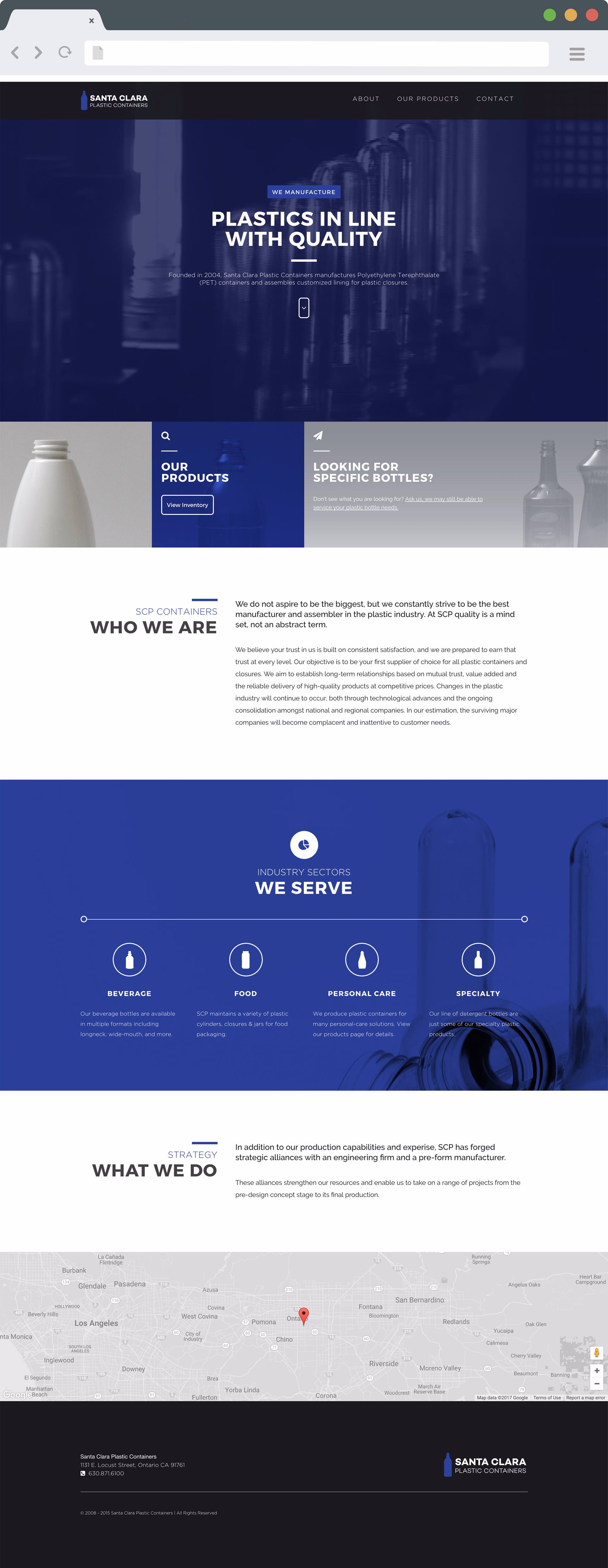
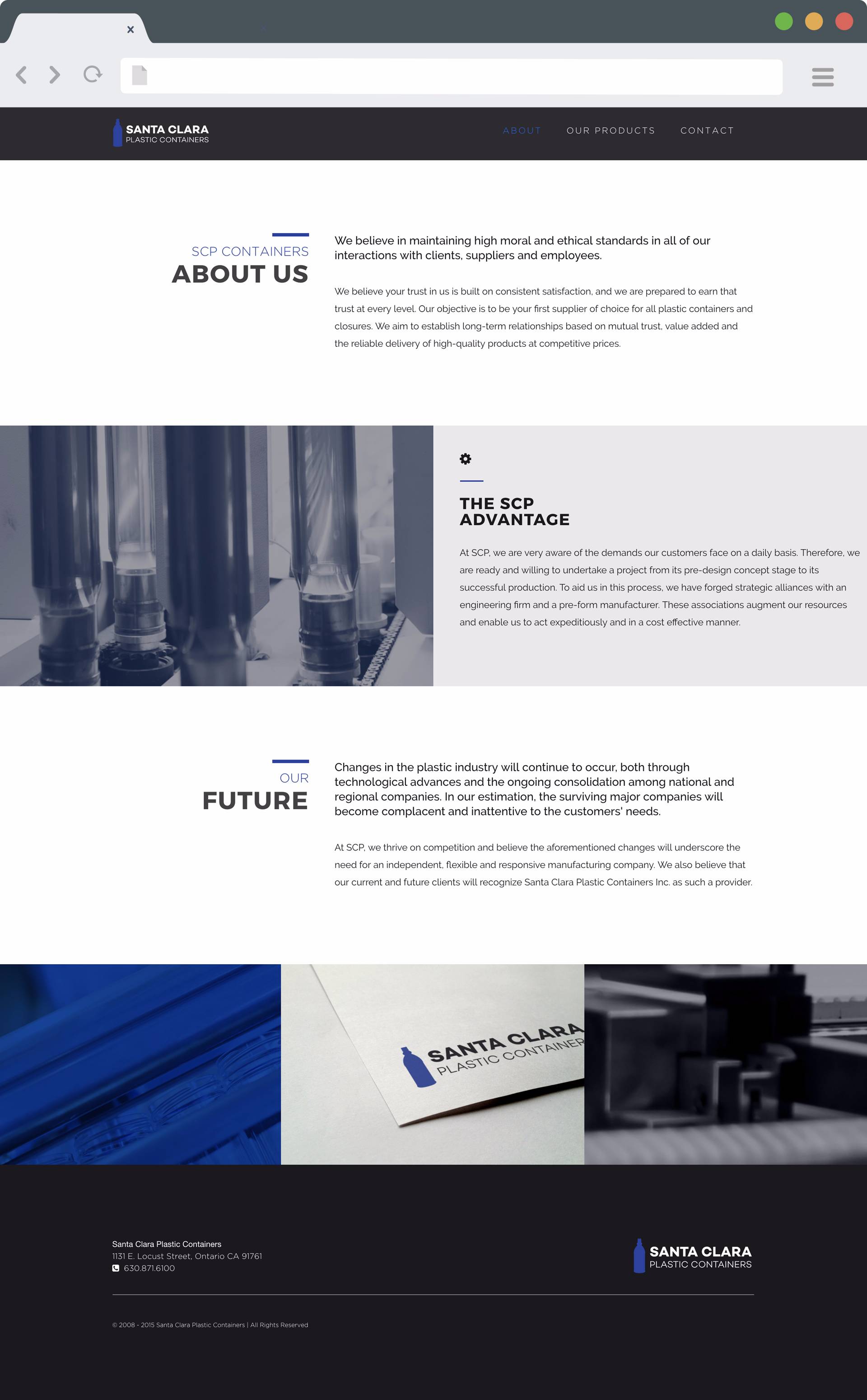
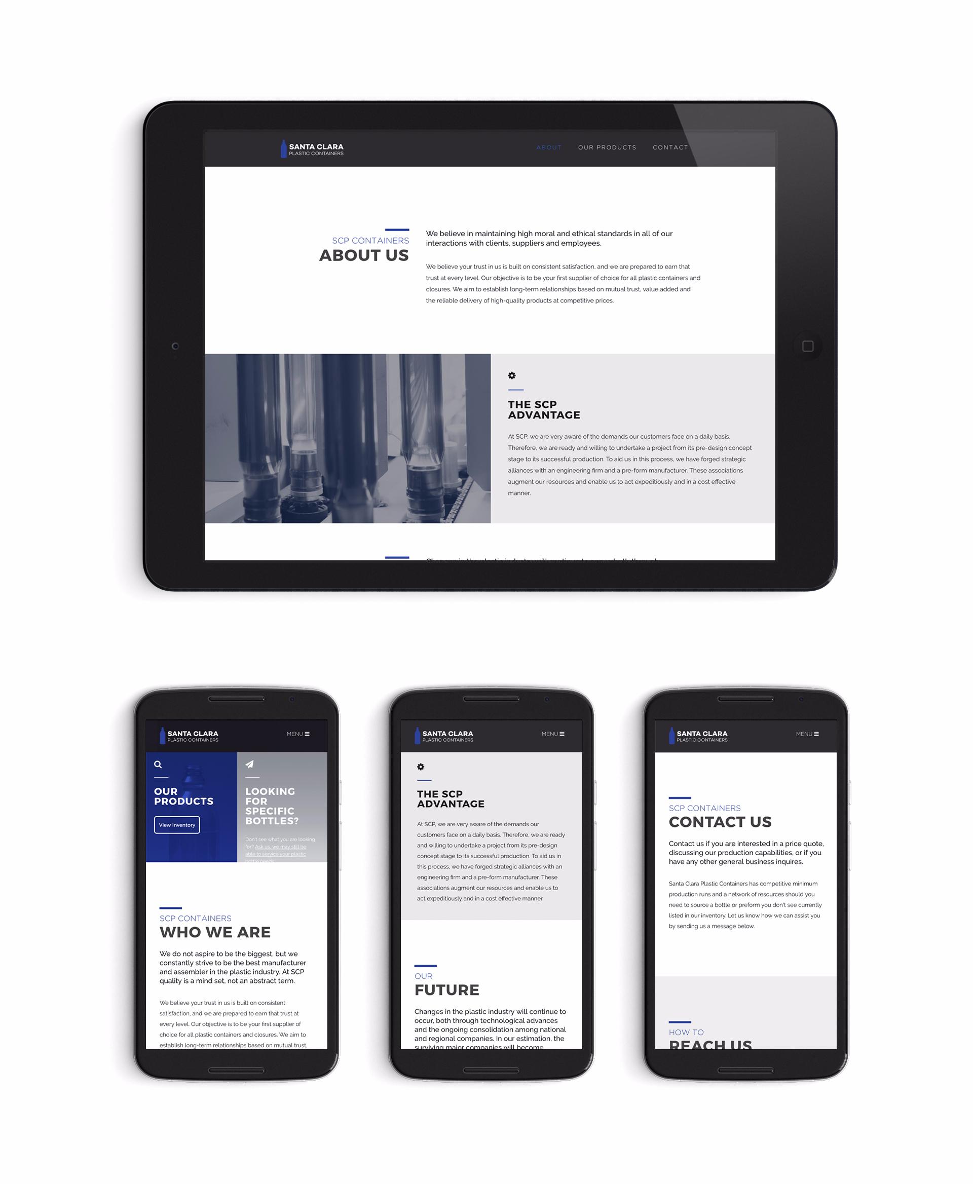
The company needed a modern & responsive website presence, along with an updated identity and marketing materials. I used the SCP brand color (indigo) to dictate the base palette, and built a clean UI of soft greys and charcoals. The understated design allows the high-resolution product photography to take center stage. A production video looped on the homepage hero instantly communicates the PET manufacturing process that is central to Santa Clara Containers.

Identity
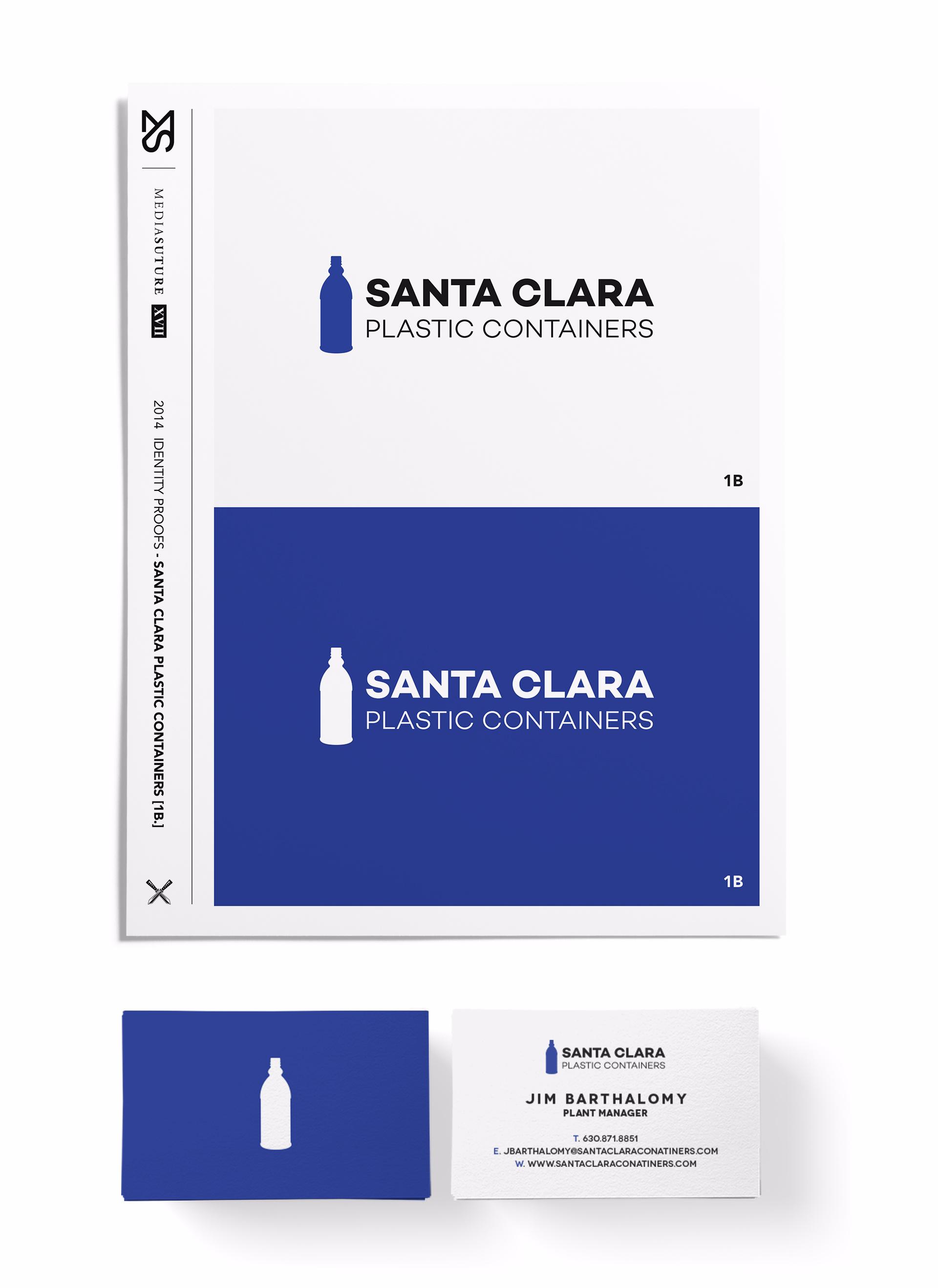
I envisioned a clean vector based icon to represent the logo mark and reimagined the company's original identity system. The new design is bold, structured and direct. A vector trace of a PET bottle supplied by the company was the basis of the mark. After a few iterations, a simple logo emerged that sits comfortably in color or reversed out in white.