

The
Grimoire
Salomonis
Clavicula


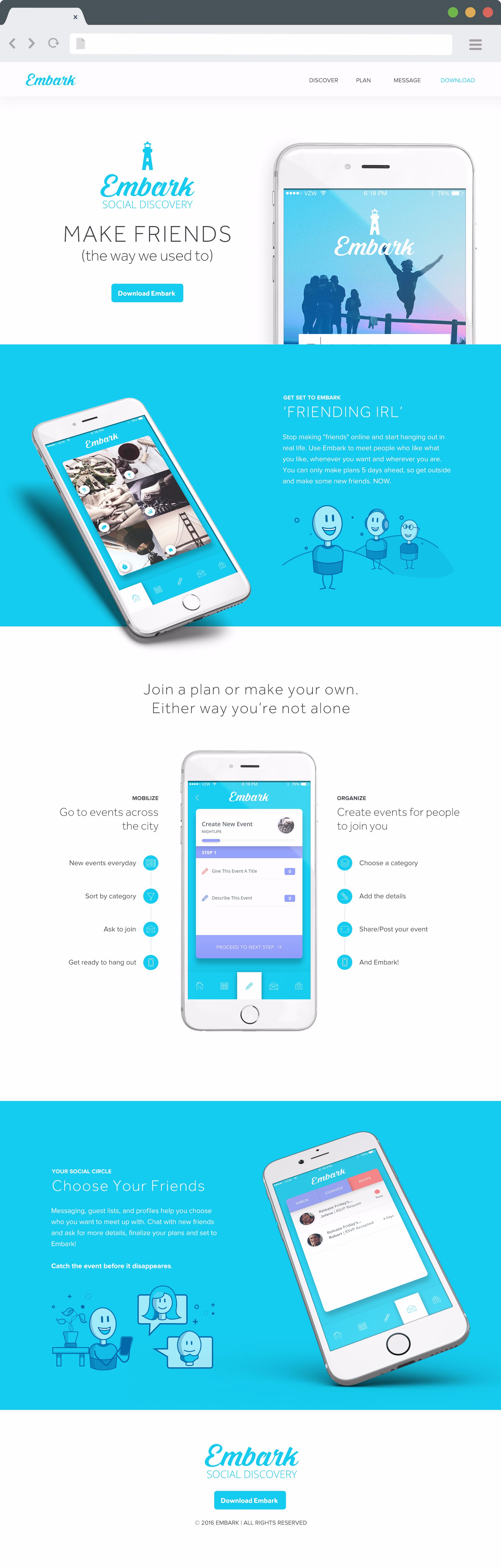
User Interface
The Embark team wanted something simple and clean. An open design with pops of color and product examples scattered through out the layout. I selected white iPhones to maintain the clarity of the design and highlight the UI of the app. Custom cartoon illustrations (to help narrate some of the client's copy) we crafted once the final layout was established. The simple cartoon sketches added just a more playfulness to the interface and dovetail nicely with the personality and tone of the Embark platform.
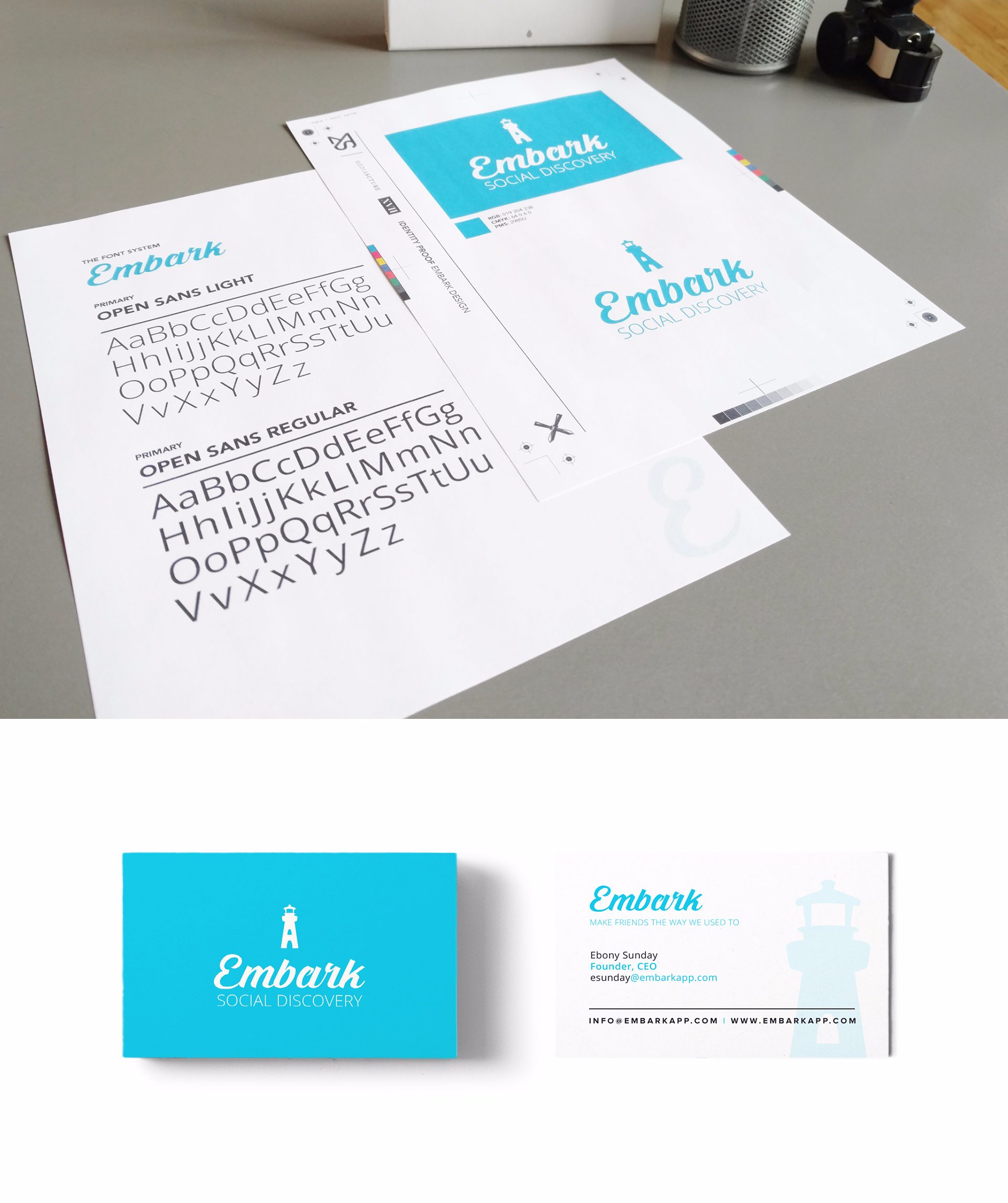
Identity
The client wanted to communicate travel and adventure and approached me with the concept of a lighthouse design. I determined that Embark needed a clean and simple mark - something to sit comfortably above the logotype I selected. After a few simple sketches, the final design emerged.
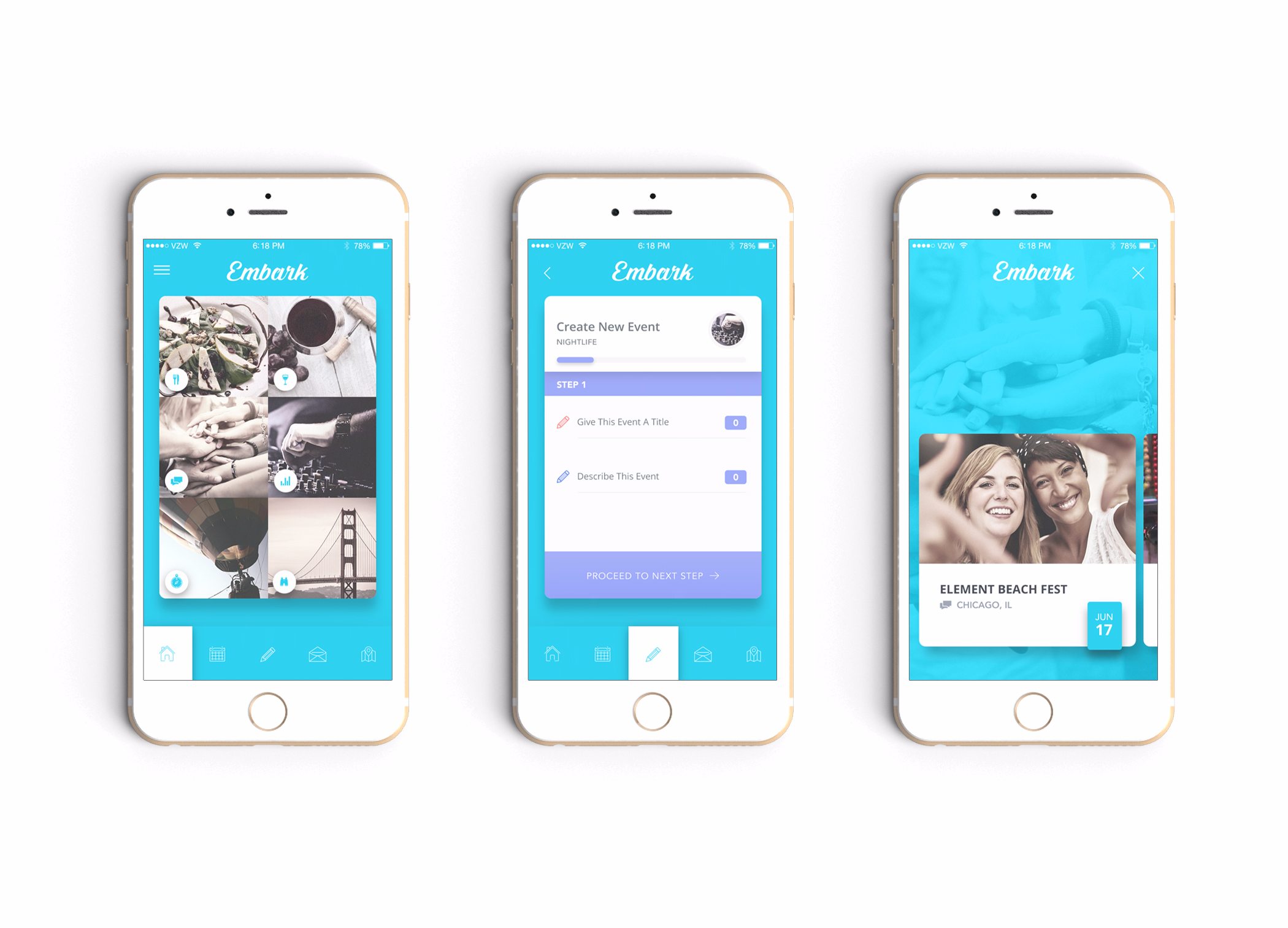
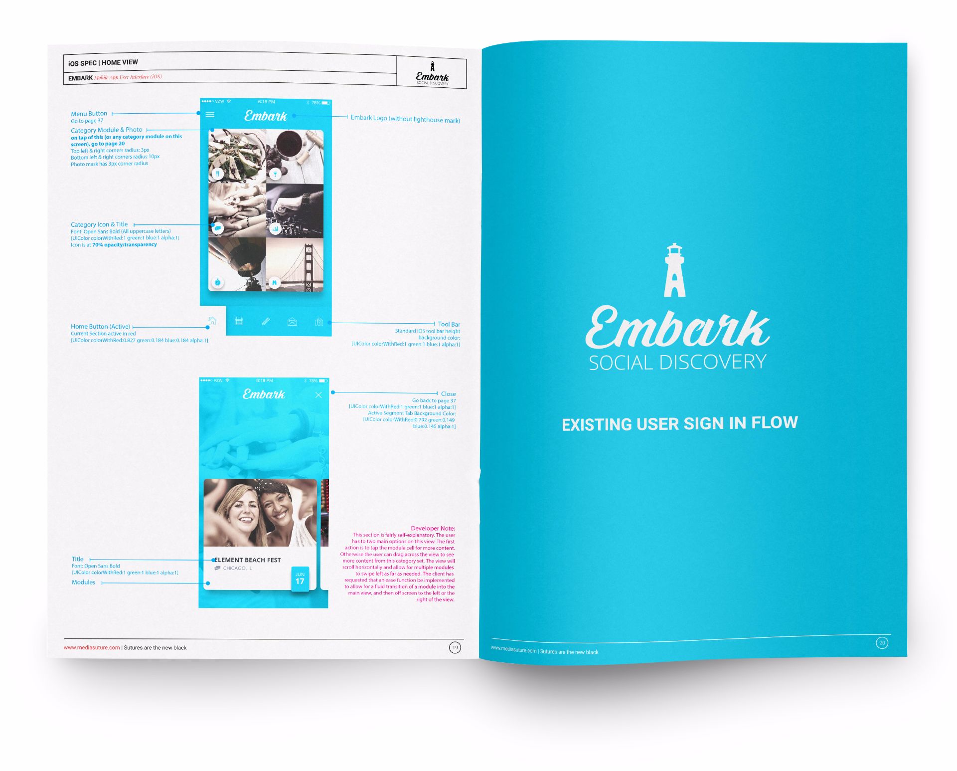
iOS UI Design
Colorful, modern and simple were the primary directives of the Embark iOS design. I selected super-graphic images to represent broad-based categories, while a small library of custom icons was created to represent navigational items and section headers. A modular layout of nested cards was leveraged to make the user's traversal of the application easy and straight-forward. Lastly, a master spec document was produced to accompany the handoff of all graphic files and sliced UI elements.
